Knowledge
The best color combinations for websites
Choosing the right color scheme for your website isn’t just about aesthetics – it’s about impact. Colors evoke emotions, shape experiences, and influence behavior, making them one of the most powerful tools in a designer’s toolbox. But where do color trends come from? They don’t exist in a vacuum.
Every year, different sectors like fashion, interior design, technology, and even the food industry set the stage for new color palettes; they determine what is considered modern, fresh, and relevant. From there, designers instinctively draw inspiration from these influences when creating digital experiences.
To go beyond listing new fashion colors, we've put together a compilation from our partners that breaks down trending color themes by industry. The compilation analyzes how the biggest influencers in design are shaping the color combinations that will characterize websites in 2025. But before we dive into the color trends of individual sectors, let's start with Pantone's 2025 Color of the Year - a color that will make its mark in many different markets.
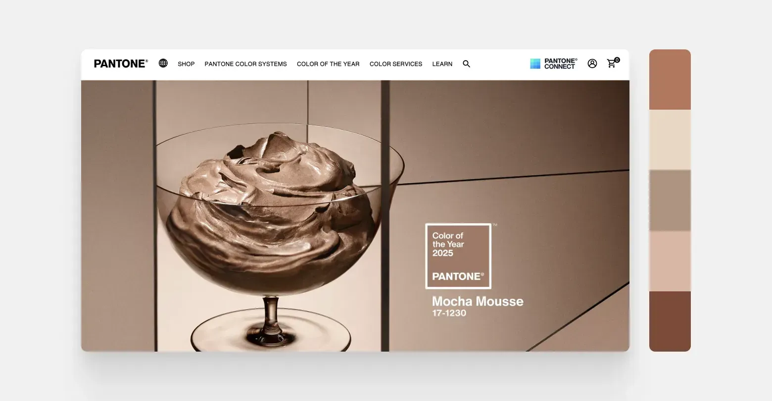
Pantone Color of the Year 2025 Mocha Mousse
Pantone is a renowned global color system that annually selects a so-called color of the year to capture the cultural and emotional mood of the world. For 2025, Pantone has named Mocha Mousse, a deep earthy brown that radiates warmth, sophisticated presence, and timeless charm.
Pantone has announced Mocha Mousse as its 2025 color of the year on its website. The color is a warm, earthy brown with a classic undertone. Pantone's annual color choices tend to have a big impact on the design world, as they are meant to capture the spirit of the year.
Why Mocha Mousse? People today crave stability, comfort, and a connection to nature. This color fulfills that need – it combines the organic warmth of natural landscapes with the sophisticated touch of vintage style.
Where will Mocha Mousse be seen?
But Mocha Mousse is not a color that stands alone – it works particularly well in conjunction with colors that either form a strong contrast or harmony according to the color wheel.
Fashion
In luxury clothing lines, Mocha Mousse will appear mixed with warm terracotta tones (earthy red clay colors) and soft golden tones.
Interior design
A key color in the growing Sahara-inspired design trend, paired with sandy neutral tones and textured fabrics.
Technology
Inspired by coffee, chocolate and baking; brings warmth and richness to packaging design and branding.
Food
Inspired by coffee, chocolate and baking; brings warmth and richness to packaging design and branding.
Automotive industry
Popular in luxury cars, especially in matte finishes and deep leather tones in interiors.
The color wheel
and color psychology
To create color schemes that speak to users, it’s important to understand how colors interact and what emotions they evoke. The color wheel (a circular disk that shows the relationship between primary and secondary colors) is the foundation of color theory and helps designers combine colors that create either balance, a vibrant mood, or a deliberately strong contrast.
Contrasting colors
(opposites on the color wheel) – create great contrast and energy (e.g. Mocha Mousse against a blue-green color like turquoise).
Analogous colors
(lying side by side on the color wheel) – create a soft, harmonious look (e.g. Mocha Mousse with rusty red and warm beige tones).
Monochrome color schemes
use different intensities of the same color to achieve a minimalist and sophisticated look.
In addition to color associations, color psychology (i.e. how colors have psychological effects) also plays a big role in design. Each color can have a specific effect on the user. For example:
Earthy brown colors
(like Mocha Mousse) evoke a sense of warmth, stability, and timeless sophistication.
Deep green colors
represent growth, harmony and balance and are well suited for brands that emphasize an environmentally friendly image.
Soft blue colors
indicate trust and calm, and are often seen in the technology and healthcare sectors.
Bright red and orange colors
stimulate energy, passion, and urgency – great for buttons or other calls to action that encourage the user to take action.
By applying these principles, you can create a color scheme for websites that not only looks good but also feels right – i.e. evokes the desired emotions in users. But as previously mentioned, color trends don’t happen in isolation; designers, brands, and other creatives draw inspiration from fashion, interior design, technology, and even cuisine to shape the visual language of their own industries.
Every year, key industries set the tone for the colors that appear in brands, websites, and products. These trends are shaped by cultural shifts, technological advances, and even economic factors. What is considered “modern” in 2025 will be shaped by the shared aesthetic of these industries.
So let's dive into each sector individually, look at the distinctive color trends there, the main color of the year in each category, and how these color palettes translate into stunning web design.
The fashion industry
Fashion trends often drive color trends in creative industries – and web design is no exception. Designers often look to seasonal fashion shows, catwalk color themes, and the visual style of luxury brands to shape their own color palettes. Pantone Mocha Mousse, a warm earthy brown, captures the current trend in 2025 fashion, which emphasizes earthy elegance and tactile comfort. This color speaks to the desire for sustainability and a simple experience of richness, and works well alongside timeless neutrals and soft pastels.
CHANEL’s website is a textbook example of how luxury brands use color in marketing. The base is black and white, reminiscent of the brand’s classic heritage, but on top of that, warm earth tones and muted pastels add depth to the site and connect it to the seasons.
The Cruise 2025/26 fashion line is presented in ivory and beige tones that reflect the sun-kissed landscapes of the Mediterranean, while the spring/summer sunglasses line utilizes deep charcoal grays and dark browns to convey bold sophistication. A light purple tone in the site's fragrance section adds a playful femininity to the overall look, beautifully woven into the look to reflect how Chanel blends timeless elegance with a modern touch.
Pallet:
- Jet Black — #000000
- Ivory white — #FFFFFF
- Soft light purple — #D6B8EB
- Warm beige — #D8CBB8
- Deep mocha brown — #9E7A4D
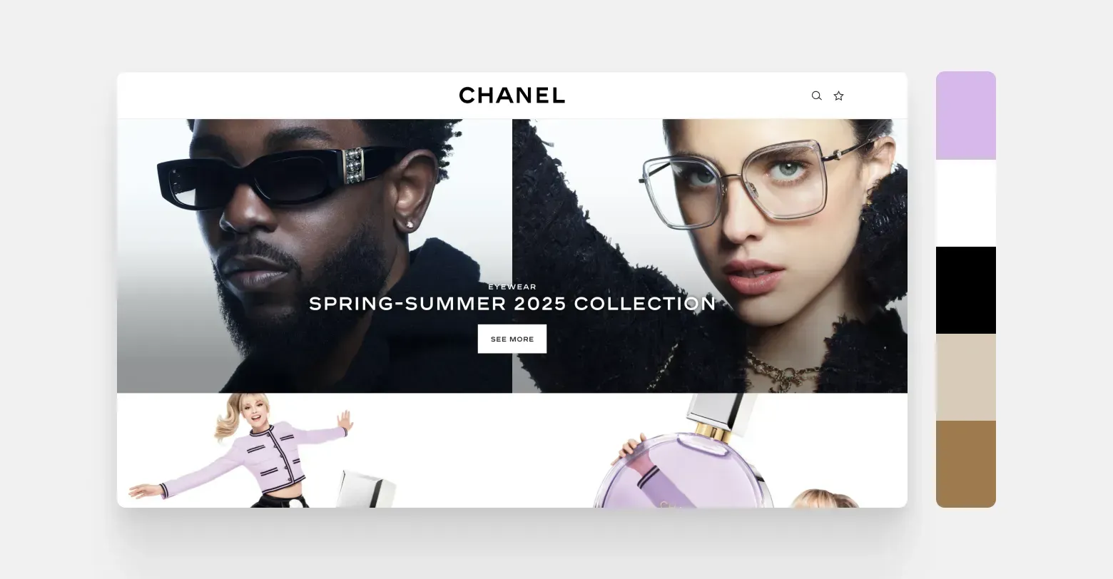
Screenshot of the CHANEL website. A classic black and white base combines with warm earth tones and soft pastels for a timeless yet modern look. Here you can see how even small touches of color like light purple in the fragrance section add a playful feminine touch to the overall sophisticated look.
Interior design
and furniture design
Interior design is once again leaning towards organic, with an increased emphasis on earthy minimalism and warm materials. In 2025, we see a growing affinity for a Sahara-inspired color palette: soft amber tones, dusty clay reds, neutrals with olive green undertones, and layered beiges that evoke sun-baked landscapes and artisanal textures. These color tones convey a sense of calm and warmth, while allowing for gentle contrasts and slightly bolder accents. Mocha Mousse fits this style exceptionally well as an earthy base color, supported by natural textures and timeless tones.
A great example of this approach is Amber Interiors’ portfolio. The visuals of the website are a mix of creamy white surfaces, a palette of greys, weathered wood tones, and deep terracotta accents. The neutral background allows for the best-quality photographs to shine, but the color palette does more than just provide a neutral backdrop—it enhances the story each space has to tell. Pale sage greens, soft browns, and chalky whites echo the materials that define the spaces: washed linen, polished stone, and brushed brass. The result is luxurious without being superficial, warm without being too rustic. It’s a color scheme that’s almost tailor-made for digital calm and balance.
Litapalletta
- Chalk white — #F9F7F4
- Spartel grey — #D7CEC7
- Dusty Clay Red — #BC8A73
- Pale sage green — #A9B2A3
- Charcoal gray wood color — #5F5C57
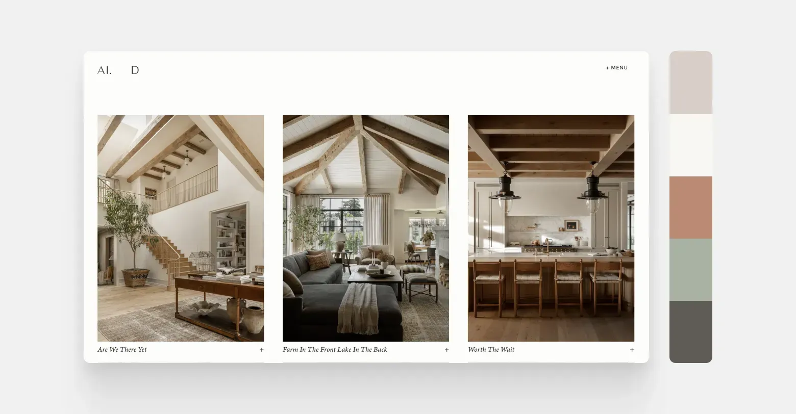
Screenshot from Amber Interiors' website. The design blends shades of cream, beige, and sage green with natural wood and stone textures to create a warm and calming feel. The result is a cohesive and sophisticated look that reflects the industrial vibe in digital form.
The technology sector
The tech industry has traditionally driven a sleek design that emphasizes performance. But in 2025, we’ll see a shift to “earthy meets innovative” color palettes that blend earthy hues with technological brilliance. Instead of relying solely on electric blues and harsh contrasts, forward-thinking tech companies are starting to adopt a more muted and thoughtful color palette that combines friendly accessibility with a desire for innovation. Think deep neutrals, clean whites, and subdued dark greens, accented by chrome or copper tones and soft gradients—this creates a more natural digital look.
Refire’s website is a good example of this new approach. The site’s design speaks volumes about clean energy innovation, blending warm metallic tones and deep greens to reflect sustainability and technological leadership. A minimalist background of light beige and charcoal grays features deep turquoise and copper accents, elevating credibility and highlighting the brand’s focus. The result is a sophisticated and confident color palette that signals progressive design without the need for neon-bright colors. The result? A futuristic yet grounded interface that reflects the evolution of design in the tech industry.
Litapalletta
- Main blue — #003F75
- Aukablár — #2884BD
- Accent turquoise — #0FACB0
- Mild black — #1A1A1A
- Graphite gray — #696969
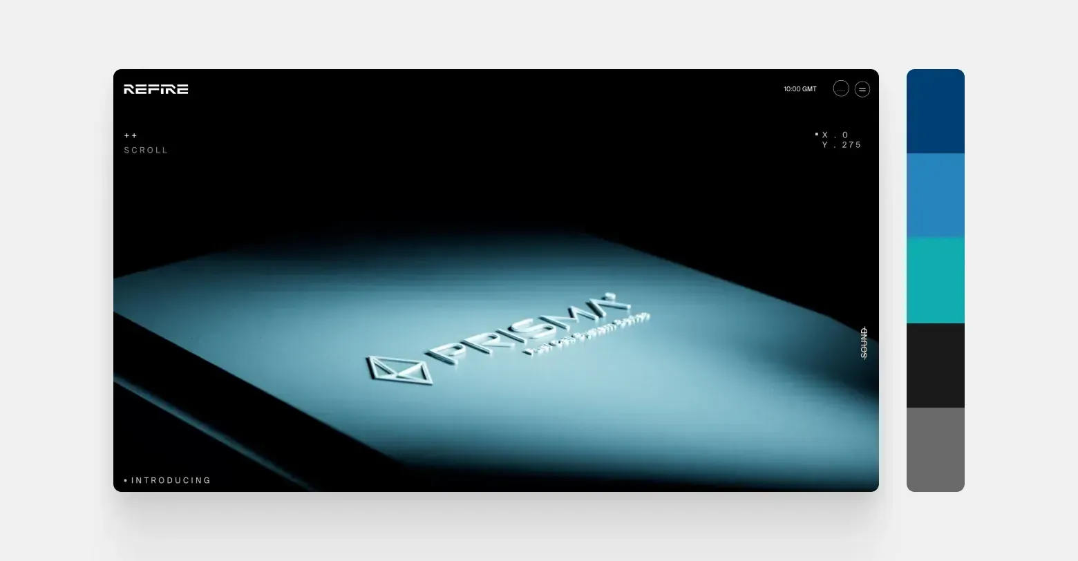
Screenshot from the Refire website. The design blends earthy tones with technological sophistication: deep greens and warm copper tones are seen against a clean, light surface. This color scheme creates a modern interface that is both reassuring and reflects sustainability in the tech world.
The food industry
Food color choices have traditionally been about freshness, warmth, and perceived good looks, but in 2025, the trend is to become more sophisticated and emotional. Instead of relying solely on deep reds or rustic earth tones, modern food brands are choosing colors that evoke trust and clarity in the minds of consumers. One such color is “Blissful Blue,” a blue tone that British consulting firm WGSN has identified as the key color of 2025. This soft and peaceful blue brings a calm and sophisticated feel to digital environments, without losing its freshness and modern look.
A great example is the “Chef” restaurant template from Duda. It combines a warm yet sophisticated color theme: a pale blue base creates a soft and calm background, while caramel browns and deep burgundy tones evoke a warm and dessert-like mood. Bright mustard yellows are used as accents and provide a vibrant spark, perfectly offset by soft creamy whites that create a comfortable balance. Together, these colors create a sophisticated, flavorful experience – perfect for restaurants and food brands that want to showcase their creativity and passion for the culinary arts without sacrificing elegance.
Litapalletta
- Blue-violet (pale blue) — #C3CFE2
- Caramel brown — #C98B4B
- Deep burgundy — #3D1B1B
- Bright mustard yellow — #FFD23F
- Soft Creamy White — #EAE1D7
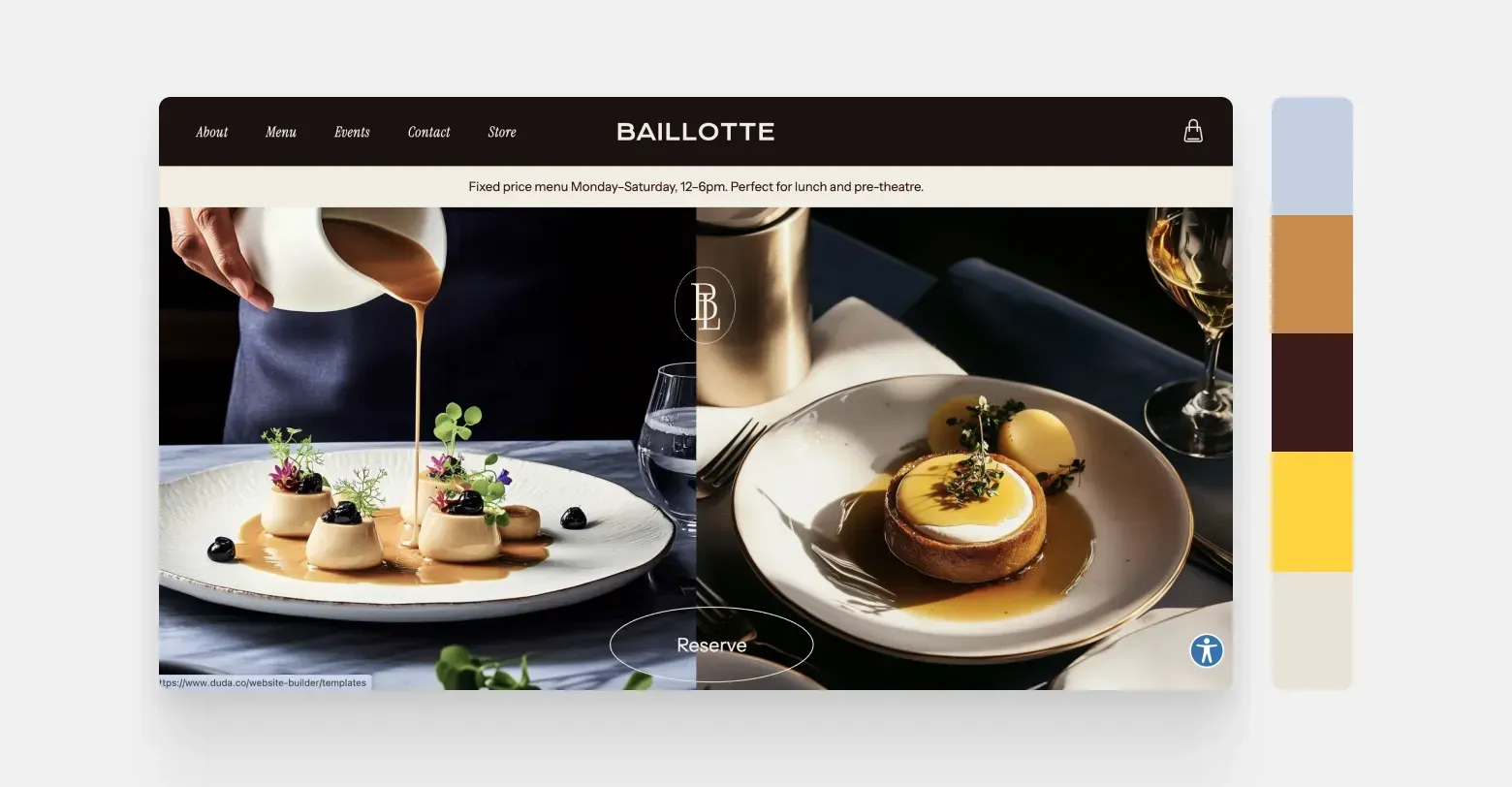
A screenshot of Duda’s “Chef” website template. Its color palette is both warm and elegant. The site’s pale blue base creates a calm atmosphere, while caramel browns and burgundy hues evoke delicious dishes. Bright mustard yellows in the details add energy, while soft cream white tones keep the overall look balanced and warm.
The automotive industry
Automakers have long relied on strong, contrasting color palettes to convey power, performance, and innovation. In 2025, color choices will evolve even further; instead of bright, flashy colors, many brands are now choosing minimalist color schemes that emphasize control and a refined image. Monochromatic palettes, chrome finishes, and deep charcoal grays dominate, with very sparing use of other colors to differentiate individual models or draw attention to specific features.
Tesla is a good example of this understated yet futuristic approach. Tesla’s website uses a pure white and deep charcoal gray background that lets the cars themselves – often shown in striking red, black, silver or white – take center stage. The red color of the cars creates a strong contrast against the darker background, emphasizing the company’s focus on power and performance. Subtle gray tones and metallic sheen in the frame reflect the cars’ sophisticated appearance and reinforce Tesla’s image as a high-tech luxury brand. The simplicity of the website design, with hardly any color except in the car images themselves, clearly demonstrates Tesla’s emphasis on modern luxury.
Litapalletta
- Hreinhvítur — #FFFFFF
- Deep Colgrár — #1E1E1E
- Power Red — #A11219
- Gunmetal silver — #B0B6BB
- Graphite gray — #4A4A4C
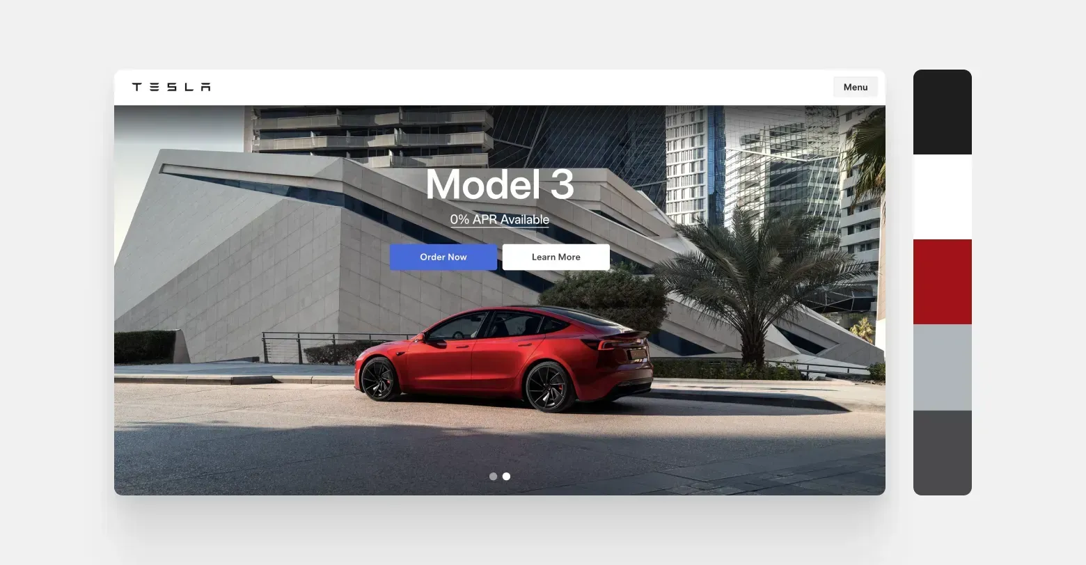
Screenshot of the Tesla website. The design is very simple in color scheme: a white background and dark gray surfaces direct all attention to the car itself. A red sports car immediately catches the eye and gives the site a dynamic look, while other colors are muted, emphasizing modern luxury in simplicity.
Final words
Other sectors
Choosing the right color scheme for your website isn’t just about aesthetics – it’s about impact. Colors evoke emotions, shape experiences, and influence behavior, making them one of the most powerful tools in a designer’s toolbox. But where do color trends come from? They don’t exist in a vacuum.
Every year, different sectors like fashion, interior design, technology, and even the food industry set the stage for new color palettes; they determine what is considered modern, fresh, and relevant. From there, designers instinctively draw inspiration from these influences when creating digital experiences.
To go beyond listing new fashion colors, we've put together a compilation from our partners that breaks down trending color themes by industry. The compilation analyzes how the biggest influencers in design are shaping the color combinations that will characterize websites in 2025. But before we dive into the color trends of individual sectors, let's start with Pantone's 2025 Color of the Year - a color that will make its mark in many different markets.